A Prettier Word Cloud
Word cloud is one of the most common visualizations we see today, especially with social media analytics. Open source libraries like D3JS have eased developers life. With these libraries we can quickly wire data and get beautiful visualizations. Thanks to Mike Bostock for giving the community d3.js and http://bl.ocks.org. With bl.ocks, we have a plethora of visualizations from the community, open to public with their implementation.
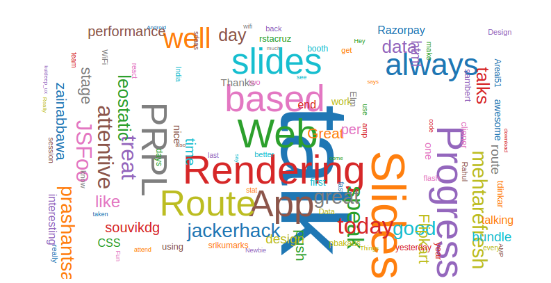
This library from Jason Davies — https://github.com/jasondavies/d3-cloud , can help you build a word cloud in 5 minutes or less. A big thank you to Jason for this handy, neat library. The out of box implementation of library would render a word cloud like this —

Not so nice word cloud
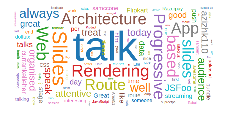
As you can see, the words are scattered all around the place and there are lot of white spaces. At first, I thought this has something to do with the values of the translate attribute. I played around a lot with different translate and transform attributes, but I could not fix the word spacing. The word cloud did not look as classy as expected :( After hours of struggle, I almost gave up! However, I continued looking at different usages of the d3-cloud library and I just happened to try changing the value of this attribute text-anchor to middle and voila! we have an awesome word cloud which looks like this —

A prettier word cloud
Here is a simple example of the same — https://gist.github.com/raghothams/7f280223bf75c5d475c20f9a8458c110#file-d3-word-cloud-js-L22
This makes my belief stronger that it is not just the implementation which we put out to the community that matters, but it is the documentation that matters the most. With better docs, we will have more people using the libraries / tools and therefore, better community adoption.